Besides the classic bag and No.5, CHANEL is known for their black, white and beige colours and I have to say that having worked there for so many years, has me a little biased towards these colours when purchasing items.
I'm automatically drawn to these shades as they match EVERYTHING.
But my quirky side is also a strong influence and I simply love bright colours when it comes to accessories.
When it comes to furniture, opting for neutral color has long been the recommendation for those selecting larger upholstered pieces, and this rule does makes a lot of sense.
A quality sofa can be one of the more expensive pieces of furniture we purchase, and for a large percentage of rooms, going with a neutral fabric is indeed the best choice. On the other hand, it could be time to consider breaking the rule. With so many richly hued options available, in stock or through custom order from the array of fabrics many vendors offer, it’d be a shame not to just go for it in the color department once in a while.
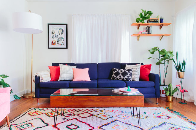
A bright navy sofa is the star in this living room of whites. If you are drawn to a bolder color for the sofa but are hesitant, consider navy, because if any color is a classic with staying power, it’s navy. And for this midcentury bungalow in Los Angeles, the lines of the sofa are an appropriate match.
Why it works: The color palette of the entire room is drawn from the rug. Its white background is repeated on the walls, its blue perfectly matches the sofa color, and the remaining colors directed the pillow and accessory choices.
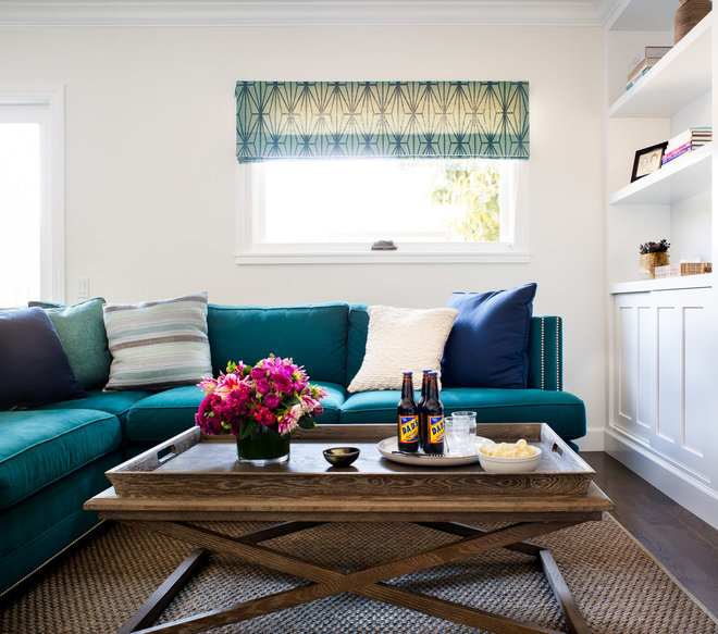
In a compact and cozy San Francisco home, this teal sectional is perfect for family life. It provides seating for everyone, while the darker jewel-toned fabric is forgiving of real life, with its spills and wear.
Why it works: The brightly saturated sofa is the focal point of an otherwise neutral room of whites and browns, with the color subtly repeated in a pillow and on the window treatment.
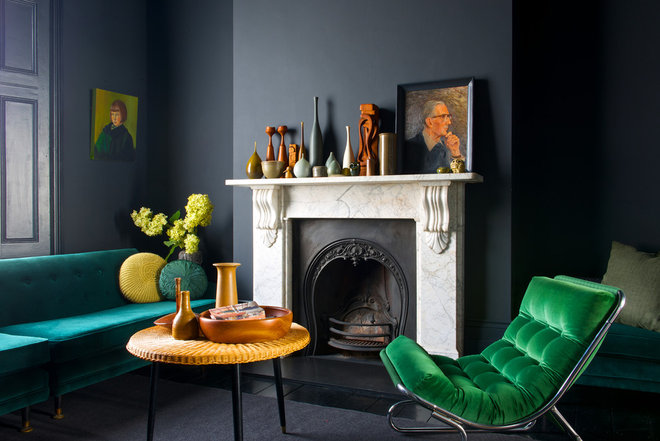
While lighter neutral upholstered pieces would certainly look at home in this room — taking color inspiration from the veins in the marble mantel — against dark moody walls the saturated teal sofa and emerald green chair simply sing.
Why it works: The slightly different jewel tones of the sofa and chair are of similar visual weight to the deep color on the walls, creating visual harmony.
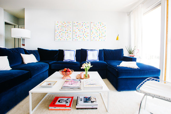
A brilliant azure sectional is the defining feature of this 750-square-foot apartment in San Francisco, efficiently providing a great deal of seating in a compact space.
Why it works: The remainder of the room is bathed in whites and a great deal of sunlight, which allows such a large volume of bold color to be visually successful. You would think the sectional would overwhelm the room, but it doesn’t.
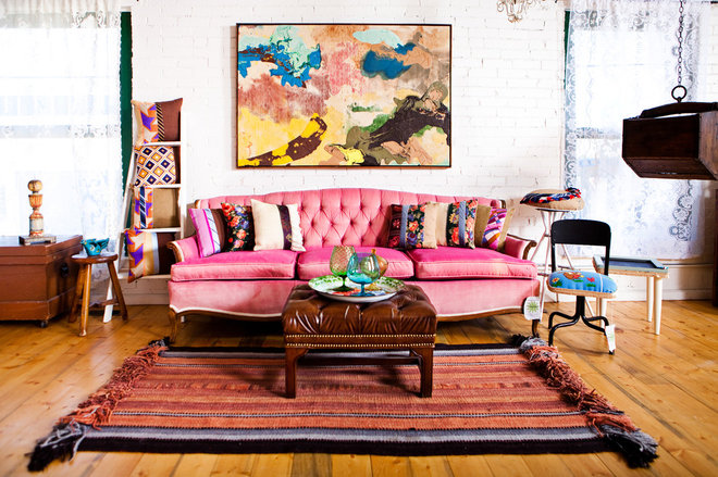
If you know where to look and are patient, it’s possible to find a vintage sofa in great condition, and this pink tufted piece is a charmer. However, if what you envision is not available through stores, consider working with a quality upholsterer to rework found pieces or update a quality sofa you already own.
Why it works: There is naturally a far wider berth regarding what color vintage furniture pieces look appropriate upholstered in, and often that same logic gets extended to the environment they are placed in.
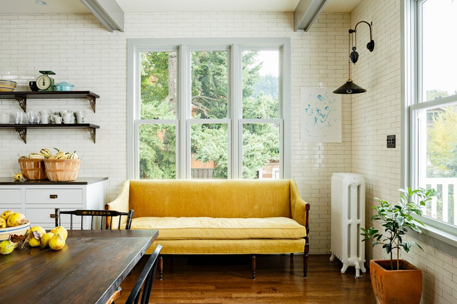
Another vintage sofa, this one in bright yellow, graces the corner of a kitchen in a renovated Victorian home in Portland, Oregon. It lends not only a happy burst of color but a cozy spot to sit (while someone else does the cooking).
Why it works: Anything the shade of lemon works in bringing cheer to a kitchen, even a sofa.
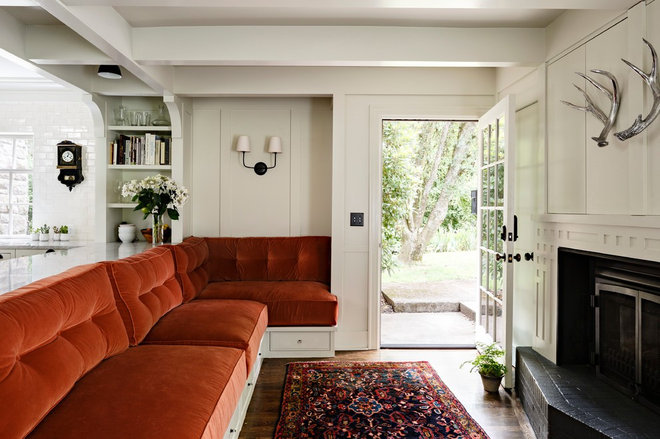
In another kitchen renovation, by the same designer as the previous photo, a kitchen wall was removed to create an adjacent sitting room. Rich orange velvet cushions form a large sectional for relaxing with a perfect view of the TV (behind panels here).
Why it works: The richly toned fabric reinforces the design goal of creating a warm and cozy lounging area that functions as part of the kitchen.
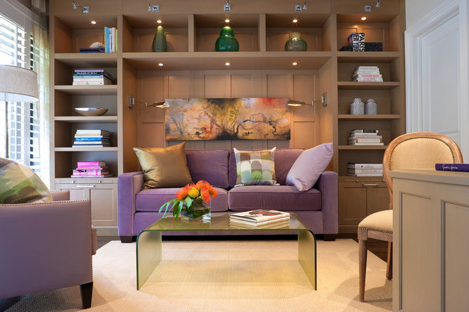
Violet is a color not often seen on upholstered pieces, but in a den that serves as an office and a guest room, the color is both sophisticated and soothing alongside warm taupe millwork.
Why it works: The built-in unit surrounding the violet sofa bed is painted with a color showing significant purple undertones, so the sofa color just makes sense.
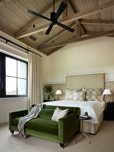
A beautiful blend of soothing neutrals makes up the palette in this large bedroom, with one exception: a striking hunter-green love seat at the foot of the bed.
Why it works: The room would lose much of its richness with theomission of this jewel-toned piece of furniture.
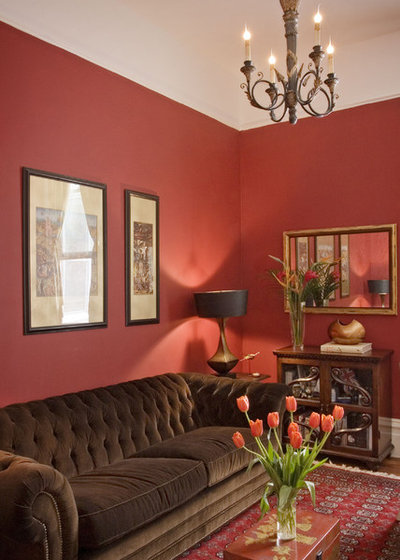
This chocolate velvet chesterfield doesn’t stray too far from neutral and mixes beautifully with the persimmon walls and carpet in this richly hued study.
Why it works: All the surfaces in the room have a similar visual weight, and the luster of the brown velvet perfectly matches the golden tones of many of the accessories.
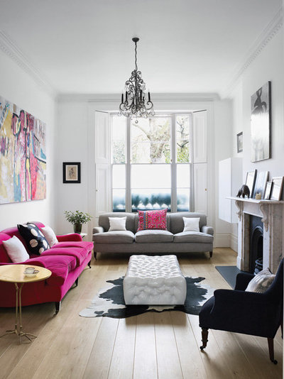
When a living room is spacious enough to place two sofas, there is typically a matching pair, but not here. While the styles are nearly identical English sofas with arms, the light gray sofa fades into the background while the vibrant pink one is a standout.
Why it works: The placement of one hot pink pillow on the gray sofa, with more pink in the artwork, effectively scatters pink around the room, preventing the vibrant sofa from appearing out of place.
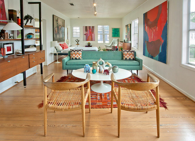
A teal midcentury sofa brings a fresh accent of color to a space with honey-toned floors and white walls while coordinating with several abstract canvases.
Why it works: White walls and pale wood tones create a neutral backdrop for the bright colors of the sofa, art and accessories. The success of the room comes through the even distribution of color throughout the living space and adjoining sleeping area in a balanced manner.
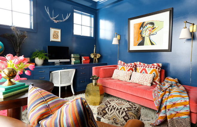
There is no restraint of color on any surface in this vibrant den.
A neutral sofa color would have worked just fine, though would not have resulted in quite the same energetic environment. Why it works: The coral sofa is a visual success because it is an equal match to the high-gloss navy walls.
How to Make a Richly Colored Sofa Work in Your Home
- Is your favorite color already present on items in your home? Would a sofa featuring this color add to the success of a particular room?
- To test if your desired color is right for the room, layer an existing sofa with a blanket in the shade you are considering. Live with it for a while to see if it’s really for you (and the room).
- Allow a boldly colored sofa to be the focal point of the design in an otherwise neutral setting, with neutral walls and accessories for visual relief.
- The opposite works as well with a completely different result: Team a richly hued sofa with equally dark walls and accessories for a densely saturated room.
- Another approach is to introduce accessories and art that feature at least a bit of the sofa color to create a seamless and balanced design.
- Source: Houzz.com

Do colored. Colored and textured. So you can play with the loose items with patterns to suit your mood. Check out Thom Felicia. I love him but I dont dare copy his style.
ReplyDelete