
My homes have been painted with safe colours- off white/ creams and at the most adventurous, brown.
As much as I would love to live in a neighbourhood with different coloured houses like the below, I see myself more in a lavender hued or natural red brick house.

Colourful homes will surely brighten your day!

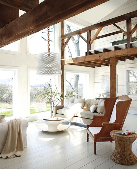
Natural brick homes with lots of wood and glass are my favourite
According to Benjamin Moore, white is this colour of 2016 with perhaps a different coloured feature wall.
BEHR, however sees varying hues, intensity and lightness levels, patterns and textures to establish your own sensory-rich space. By the way you should check out their uber cool website! You can "paint" walls using their online software.

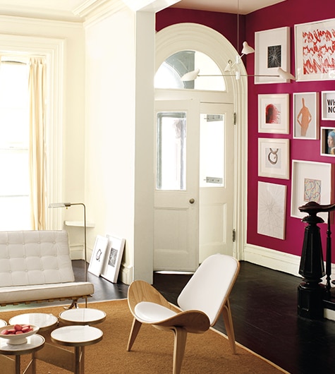
According to Diamond Vogel, For the first time, Pantone’s Color of the Year 2016 brings together two shades -- Rose Quartz, a soft pink, and Serenity, a muted periwinkle-blue.
To get the dreamy pastel look, choose Diamond Vogel’s 1069 Pink Touch and 0596 Lazy Day.
Through the Pantone Color Institute, Pantone charts future color direction and studies how color influences thought, emotions, and physical reactions.
Pantone chose the two subdued tones for 2016 due to their soothing natures, something the Institute believes consumers will be eager for in the coming year.

The above is my dream living room by the way
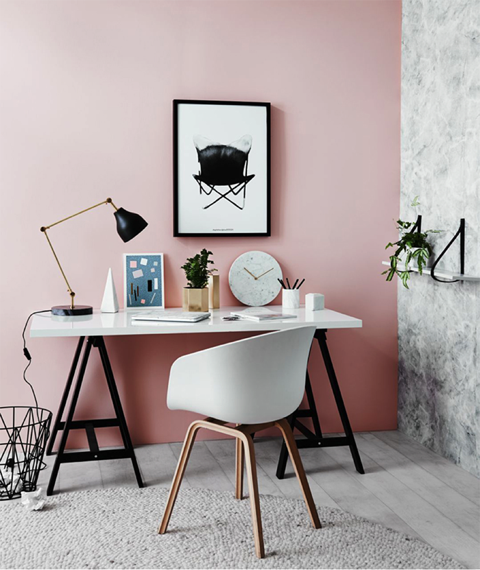
Dulux Paints also has a few different shades of mustard, soft pink, periwinkle blue, teal and olive in mind as seen from photos they shared on their website.


Not sure why there is a mop hanging in the middle of the room in the photo above.
So there you have it! The colours of 2016!
Which is your favourite?
As much as I would love to live in a neighbourhood with different coloured houses like the below, I see myself more in a lavender hued or natural red brick house.
Colourful homes will surely brighten your day!
Natural brick homes with lots of wood and glass are my favourite
According to Benjamin Moore, white is this colour of 2016 with perhaps a different coloured feature wall.
BEHR, however sees varying hues, intensity and lightness levels, patterns and textures to establish your own sensory-rich space. By the way you should check out their uber cool website! You can "paint" walls using their online software.

According to Diamond Vogel, For the first time, Pantone’s Color of the Year 2016 brings together two shades -- Rose Quartz, a soft pink, and Serenity, a muted periwinkle-blue.
To get the dreamy pastel look, choose Diamond Vogel’s 1069 Pink Touch and 0596 Lazy Day.
Through the Pantone Color Institute, Pantone charts future color direction and studies how color influences thought, emotions, and physical reactions.
Pantone chose the two subdued tones for 2016 due to their soothing natures, something the Institute believes consumers will be eager for in the coming year.
The above is my dream living room by the way
Dulux Paints also has a few different shades of mustard, soft pink, periwinkle blue, teal and olive in mind as seen from photos they shared on their website.


Not sure why there is a mop hanging in the middle of the room in the photo above.
So there you have it! The colours of 2016!
Which is your favourite?
Ika love colorful house and simple decoration. My dream house I want every corner have a pink color hahah
ReplyDeletehttp://www.unlimitedbeautysecret.com/
You dream living room also my kind of dream living room. it is so pretty and lovely. <3
ReplyDeleteLove the ideas here! I prefer something minimalistic for my own place. :D
ReplyDeleteGreat! I have some ideas for my new house. :) Hopefully I manage to paint it nicely.
ReplyDeleteI love colorful homes! But I think I sit better with pastel hehe. So pretty!
ReplyDeletelove all the photos there. I would prefer something simple yet classic for my house :D
ReplyDeletenice house deco. wish mine is the same too.
ReplyDeleteI love bright colours. Unfortunately, I can't afford my own pad yet.
ReplyDeleteOh my god, all those pictures above are sooo gorgeous.. I really would love to stay in that place... but I do not have my own place yet and I bet renovating it all to get the pictures above will take a pretty penny or two too...
ReplyDeleteMy favourite is pink colour. It looks sweet and nice.
ReplyDeleteI wonder how brown makes your house looks like. Never think how brown will looks like but definitely a interesting color to try! Khakis color is pretty!
ReplyDeletebeautiful and nice pic
ReplyDeleteI love the soft colour and I plan to paint my bedroom with soft pink
ReplyDeleteI like the Pantone living room color tone & layout, its so artistic.
ReplyDeleteI like the colourful house. It would be awesome if my neighbour's houses are like this XD
ReplyDeleteI actually love the colorful one and not to stick only to one color. Cause for me, it feels like it giving me a lot more of positive vibe and energy for my days. :D
ReplyDeletei love the colourful home concept, i want to build my house like a toy house made of legos
ReplyDeleteI like the striking colourful one.. Nice..
ReplyDeleteI like colors. I believe it can affect your mood so choose something wisely according to your needs :)
ReplyDeleteall beautiful, wish i have an artistic sense like this. Then my home will look way better.. now its just white, white and more white everywhere.
ReplyDelete